Here is some more detail about the process behind creating this logo. Tony had contacted me about doing a logo for his homestead/farm on his property in New Jersey. I had done some other work for him in the past, so he contacted me again for this.
Initial ideas
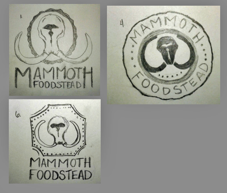
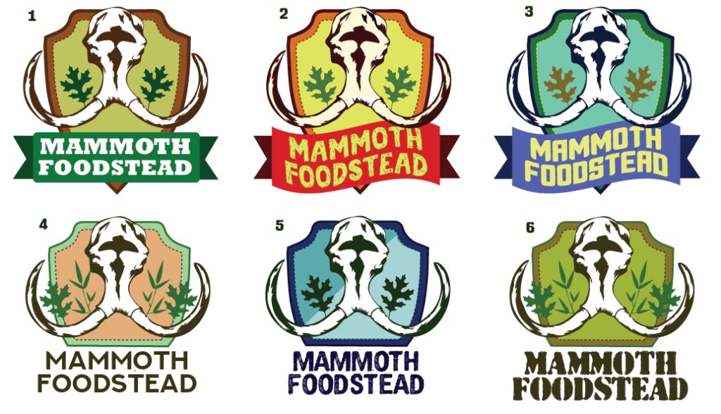
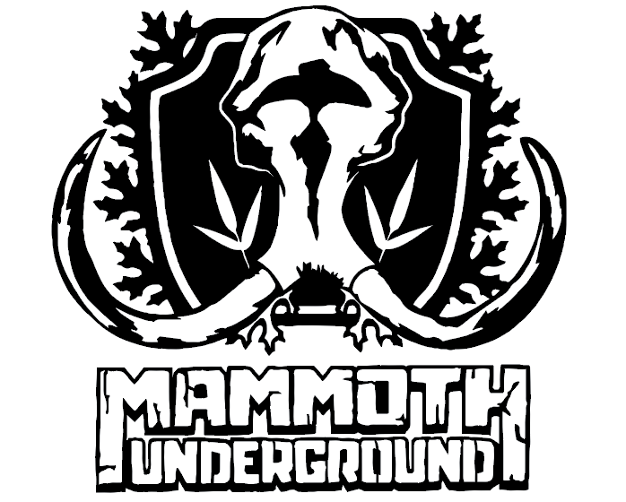
He knew he wanted to include 2 specific types of leaves, a mammoth skull, and possibly some lichen. Originally, he wanted to call it Mammoth Foodstead.
I drew out some (badly drawn!) ideas, probably around 10. I liked these 3 the best.
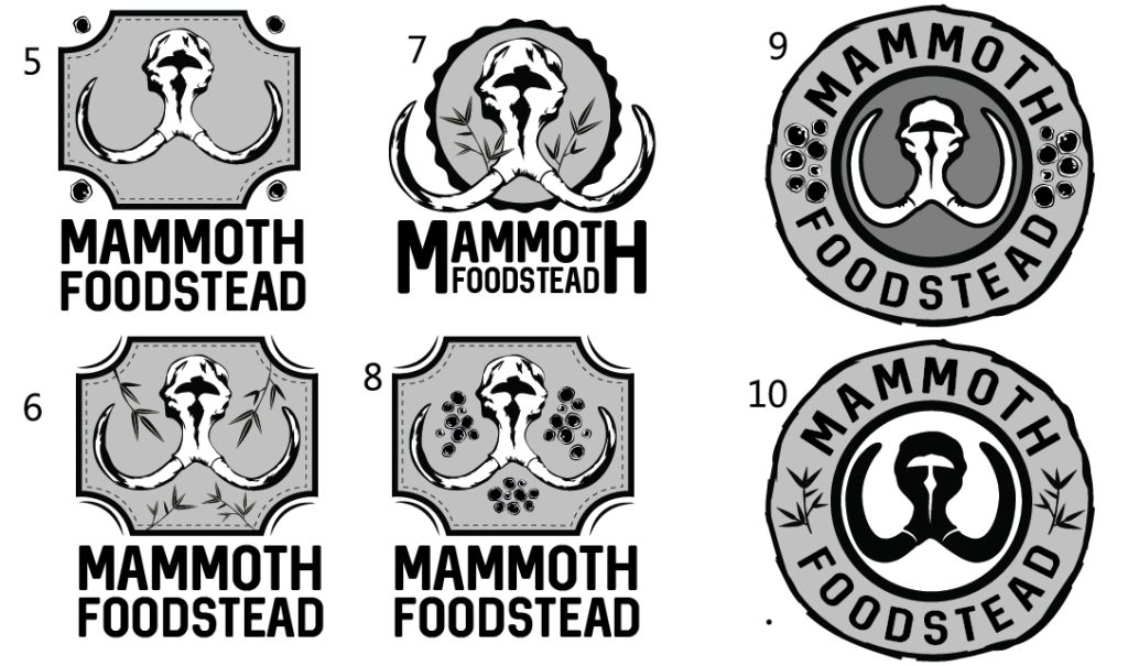
I started to recreate better versions in Illustrator and also came up with a couple other ideas in the process. I sent them to Tony.
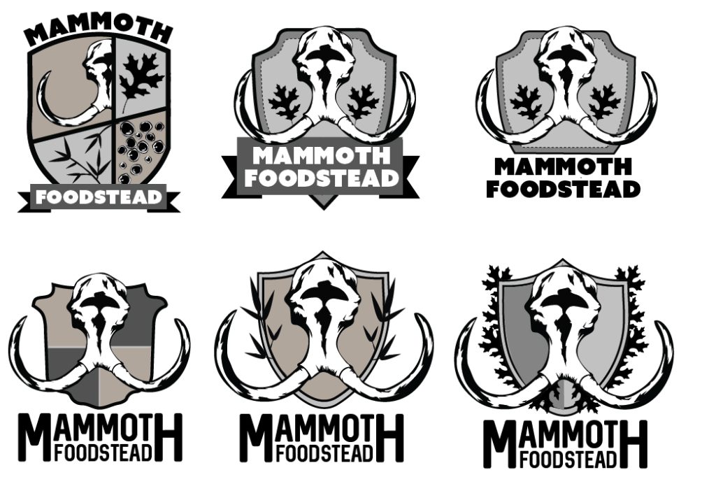
He decided that he wanted to include a shield as part of it. So, using what I already started, i edited the logos so far to use a shield type shape (and came up with a few new ideas also)
He liked the 2 of the options that I sent him, so continued on with those, switching up the leaves and adding some color/font options. He didn’t have any specific colors in mind, so I tried out mostly nature-y combinations. Added some pink/purples in if he was feeling a lil crazy.
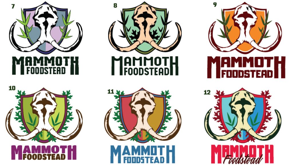
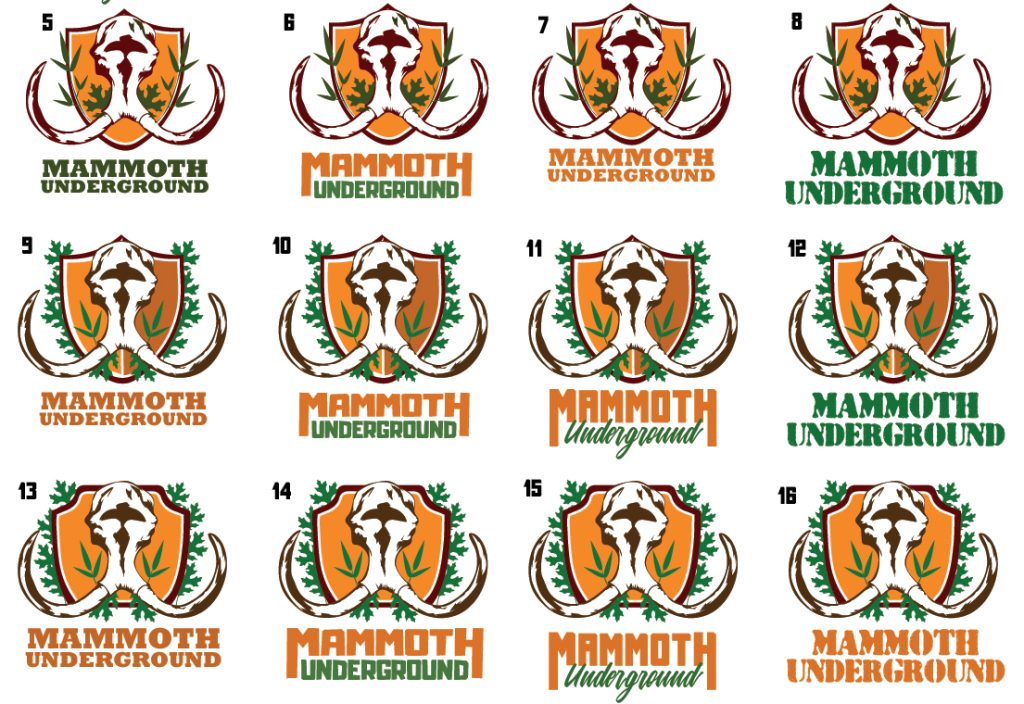
After deciding what shield shape he liked and color scheme, I continued on with some more leaf placements and font options. He also decided to switch up the name and use “Underground” instead of “Farmstead.”
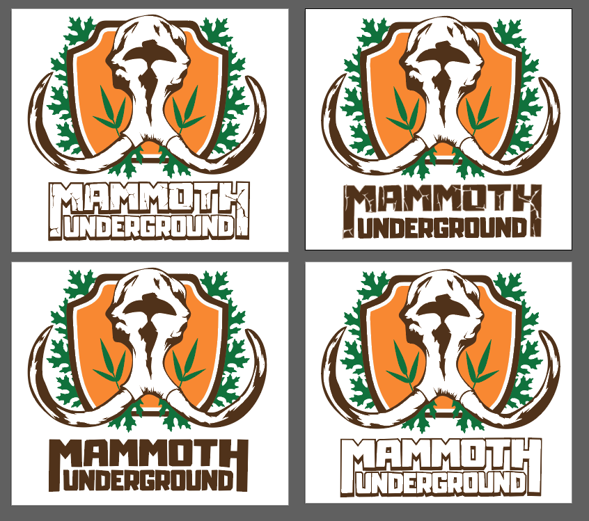
We settled on a final design. He wanted to see some slight “cracks” in the word “Mammoth,” so I tried that out. I preferred it without, but he liked it so we kept it.
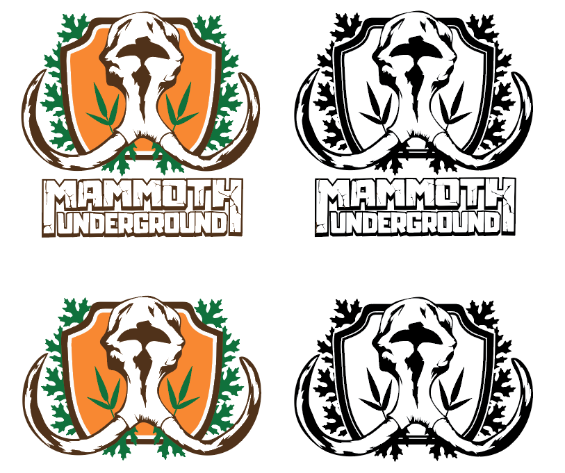
Final version
He also asked for a stencil/stamp version so I edited the black and white one to work better for that.